Tuesday, May 25, 2010
Wednesday, May 19, 2010
Monday, May 17, 2010
Thursday, May 13, 2010
Tuesday, May 11, 2010
Portraits Review
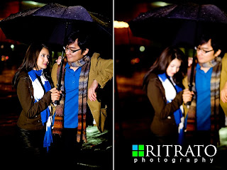 When i first saw this picture my eyes were captured by the fact that this is a collage and it kind of looks like these two pictures are telling you a story. The one on the left is clear and in focus, the other one is just the opposite: blurry and unfocus. In the fisrt one the couple is looking at eachothers eye and that transmits more emotion than the secod one when she's looking down. I think that it was a good idea that both subject were wearing the same color (scarf & t-shirt) that helps you not to focuse more on one subject than the other. I also really like the fact that it was raining, it seems that the picture is more active and natural, like they're doing something normal that they always do togehter.
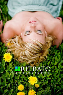 This is a completely different portrait compared to the other three that i posted before. The angle is the biggest difference: up angle from the back of the subject. One of the things that i noticed at first were the flowers and the contrast between the grass and the girl. Like in the other pictures the lower part of her body is blurred and that lets your eyes to focused on her face more than evrything else. I also noticed that her make up (eye shadow) matches her dress and that is a hind that this picture is professional and not a snap shot. Another sign that tells you that this picture is professional is the printed name on the picture itself (Ritrato Photography).
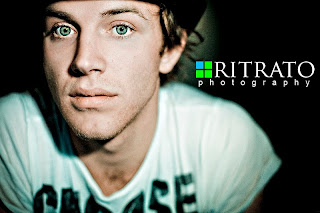 The first thing i noticed looking at this picture are the eyes. They capture your attention because of their bright color and also because the rest of the picture is blurry, just his face is on focus. That's one of the thing that i like the most about picture, they look really professional and i would use it on portraits that i will take. Even is his face is perpendicular to the camera i still like this picture because it's a really close out, there's basically not background and his face is not in the middle of the picture but on the side.
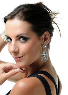 Your attention is focused to the woman's face and i personally noticed the back of her dress and her hearings. This is not a snap shot, it looks professional especially her pose, her hands, and also since the background is white i think that it tells you also that this picture is professional.
 One thing that i also like about this picture are her hands, her nails are perfectly done and this gives more style and professionality to the picture. I also like the fact that her face is not perpendicular to the camera but you can just see her profile, and i personally like it a lot so i think i will use it in future portraits.
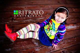 The first thing i saw when i saw this picture were the colors of the clothes, really bright and colorful. But the thing i like the best is the angle of the picture, she's looking at the camera but her face is not direct to the camera. This image look professional because of the background that is blurry. I think it is a great shot because it look natural and good at the same time, the girl is smiling and it seems she's enjoying it too so she's not forced to pose.
 The first thing i saw when i saw this picture were the colors of the clothes, really bright and colorful. But the thing i like the best is the angle of the picture, she's looking at the camera but her face is not direct to the camera. This image look professional because of the background that is blurry. I think it is a great shot because it look natural and good at the same time, the girl is smiling and it seems she's enjoying it too so she's not forced to pose.
Friday, May 7, 2010
Thursday, May 6, 2010
2 Article Review
Traveling Photographer by Lori Friederich
New Orleans
New Orleans ia a beautiful and ispirational city, with its daytime jazz and nighttime reverly everything that you capture is just amazing. But there's no better time to capture the energy of this city is during the Carnival season. Here are tips to capture it all:
New Orleans
New Orleans ia a beautiful and ispirational city, with its daytime jazz and nighttime reverly everything that you capture is just amazing. But there's no better time to capture the energy of this city is during the Carnival season. Here are tips to capture it all:
- French Quarter. You'll see walking parades of tourist and locals wearing costumes and masks. Everything is characterized by cobbled streets, bright stucco walls and wrought-iron balconies.
- Jasckon Square. St. Louis Cathedral is the most important element, white exterior with jazz street musicians in the park it's a perfect combination.
- The parades. They take place in Downtown, Canal Street: great place for brightly lit nighttime parades.
- Cities of the Dead. So named for their above-ground vaults, New Orleans' cemeteries offer a break from the crowds and tourists. Interesting fact: you may catch believers at voodoo queen Marie Laveau's tomb.
TILT Swift - How to make cool, convincing faux-miniatures
Some photographers use a tilt/swift lens to accomplish the look of their picture for picture populated by "tiny toys". It's simple to get this effect in Photoshop. This technique works better on subject that are already in small frame.
- Start by going to Layer>Duplicate Layer>New Adjustment. Choose your contrast from the pulldown menu to make your own adjustment. Change your Curves adjustment.
- Toy set are usually painted in bright colors so add some saturation. Layer>New Adjustmen t Layer>Hue/Saturation and add about 30 points.
- Decide the area to keep on focus in your picture. Select your Background Copy Layer, and then type B on your keyboard to get the Brush Tool. You'll paint on your picture the area that you want to keep on focus.Set your brush's hardness to 0.
- Hit Q on your keyboard to enter the Quick Mask mode. Set your foreground color to black, hold down the Shift key, and paint a straight line over the area you want to remain focus. When you like your line, type Q again to exit Quick Mask mode.
- Now it's time to blur the image. Go to Filter>Blur>Lens Blur.
- Once your in the Filter dialogue make sure that the Source:None is selected under Depth Map. Mess around with the rest of the slider, it determines just how much blur you add. Then click OK to see your finished image, complete with the effect of your Adjustment Layers.
Subscribe to:
Comments (Atom)


